There has been a lot of to and fro in the media about Donald Trump’s signature ever since that now famous tweet by J.K. Rowling.
Websites like Huffington Post and Mashable had a field day discussing JK Rowlings’ tweet about Donald Trump’s large signature in which she said: “ I didn’t believe in graphology until about three minutes ago.”
Also in the tweet was a reference to an article in handwriting-graphology.com that had some very negative things to say about large handwriting.
Now although the inference was clear from the picture, Rowling did not specifically mention any direct correlation between Donald Trump’s signature and the negative personality features mentioned in the post.
However, there were those who did extract some choice descriptions from the following:
On the negative side, large writing means that we are before an arrogant person, conceited, haughty, who needs to exhibit compliments and recognitions, tyrant tendencies, exhibitionist and phony personality that may become megalomaniac with lack of a critical sense. The insecurity and inferiority complex and lack of self-esteem may be compensated with a large writing.
When the signature is larger than the text, this reflects pride, consciousness of self-value and on the negative side it shows the individual has more ambitions than real possibilities.” (This appears to be a rather clumsy translation from the Spanish website)
There can be no argument with that. But at the same time it should be clear that there are many positive features in large handwriting too. However, these were not mentioned in the discussions and various articles that ensued.
Now I am not writing this in order to defend Trump. My interest in this is purely graphological and not political. I believe that it is important to maintain an impartial attitude to handwriting without using it to strip out one aspect to back up or justify a particular point of view. Furthermore, it is not within the province of graphology to pass judgement on any individual no matter how famous or pedestrian.
So here is another clip from the same article I mentioned just to show you that there is another way of interpreting large handwriting.
On the Positive side: “Personalities with great skills for communication, extroversion, physical dynamism, vitality sociability and generosity. The are expressive individuals who look forward to connecting to others, optimistic, and they are not characterized for being too reflexive (first they do, then they think), self-confident, who trust their own value. Ability for command and suitable for management positions, they have excellent panoramic vision of situations and an elevated self-concept.” (Again I must mention that this is a translation from the Spanish.)
What I am trying to do here is to set the record straight with regard to the significance of impartiality which is an important tenet of graphology.
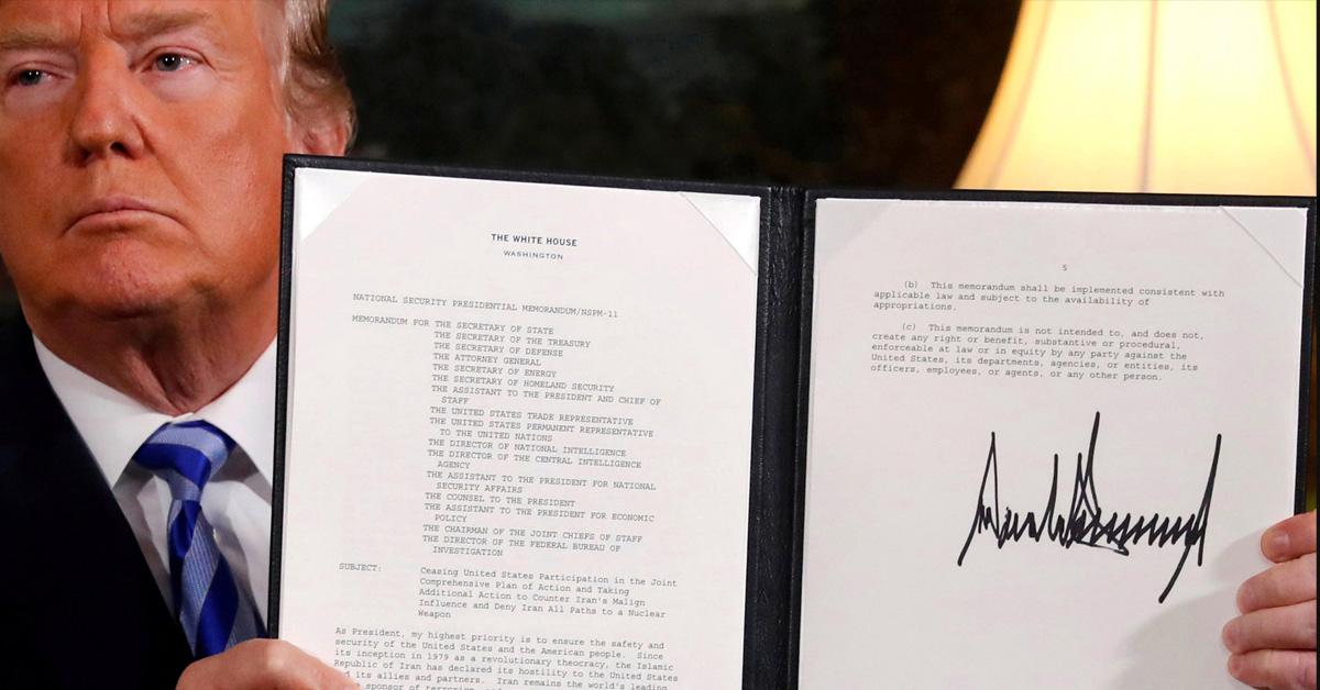
Granted that when we look at Trump’s signature in the picture above, the first thing that we see is size. But in this case his signature is intentionally large on the signed document which is being held up for the TV cameras. Furthermore, with regard to the darkness of the stroke, clearly some type of felt-tipped pen was used in order to give the signature further prominence.
Which is why in all fairness we cannot presume that the size of that signature is a true reflection of Trump’s regular handwriting. You have to look at his signature in relation to a page of his regular handwriting which is not on display here.
In fact size is but one aspect. There are other elements in the signature too that would need to be taken into consideration to give a more balanced point of view.
The most striking of these are the angular formations, the strong downstrokes, the discrepancy between the length of some upper zone strokes and the middle zone and the complete absence of any roundedness. Adamant and unyielding one would infer.
Other dominant traits that stand out are extreme confidence, power and aggression.
But in any case, if we want to arrive at a fuller or more comprehensive interpretation we would need to look at a page of his everyday, normal handwriting to which his signature has been appended. Only when seen in context can we make a proper assessment of the significance of Donald Trump’s signature.
Of even greater interest is the surprising similarity between Trump and Melania’s handwriting. The felt-tipped pen is largely responsible. Other similarities can be seen in the initial strokes , the straight downstrokes and the angularity. But there the similarity ends.
Because while we see power and aggression in Donald Trump’s signature, it is not at all present in Melania’s signature which is controlled and constrained.
It would seem that Melania is more comfortable with her first name as it is more open. But the word “Trump” is very tight with no spaces between the letters.

The illustration from the UK Daily Mirror.
Join me at The Graphology Review to get more free articles like this straight to your inbox:


Comments