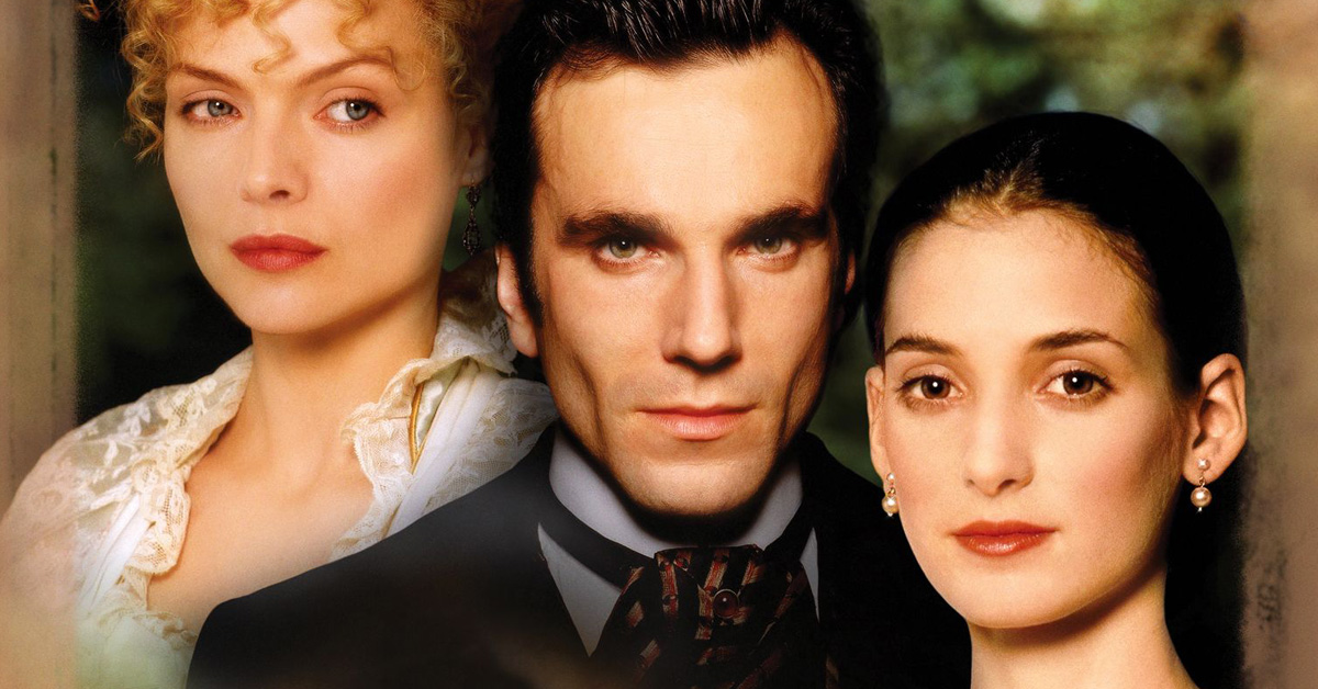
I was watching a replay of the 1994 Scorsese movie, The Age of Innocence with Michelle Pfeiffer and Winona Ryder when I came upon a rather curious Graphology gaffe!
In the movie, a lavish party is prepared for an important social occasion and invitations are sent to all the most prominent socialites and dignitaries of New York.
But embarrassingly, all the invitations are declined with various handwritten excuses.
Now normally I am not a very observant person when it comes to dress and outer appearances but when it comes to handwriting, my antennae are always on the alert.
So when the handwritten refusals appeared very briefly on the screen, I soon noticed that all the handwritings looked the same.
But I was too absorbed in the film to take further notice until later when I looked up and read a review about the movie.
I was intrigued to learn that certain film critics had also noticed that the handwritings from the different guests were similar and among other minor blunders, it was cited as a “goof” in the movie.
Interestingly, I had just read the book by Edith Wharton on my Kindle and that is why I was keen to see the movie. Not only that – I always enjoy a good period piece.
Anyway the movie did go on to win an Oscar and a number of other awards.
But it just goes to show how handwriting tends to remain top of mind when you are an obsessive graphologist!
Join me at The Graphology Review to get more free articles like this straight to your inbox:


