It isn’t often that one finds such a charming letter written by a queen.
But I did indeed find one in the stately vaults of the Manuscripts Collection in the Dwight D. Eisenhower Museum.
There among the austere documents in the museum I found this informal and charming letter in the queen’s own handwriting. And it reveals so much about her.
A remarkable aspect of the queen’s personality was her modesty and complete lack of ostentation. Remarkable because royalty by definition is very much involved with spectacle, and pageant.
One would have expected the queen to be affected by this in some way. We could have expected to see a hint of pride or at least a small sign of self-importance. But taking a look at her handwriting we see none of these things.
Rather there is genuine modesty, a lack of affectation and a desire to connect with people in a natural and sincere way.
The Queen’s Handwriting

In the queen’s handwriting shown here, we notice that the lines are well spaced while the words themselves are a little further apart. This would suggest an awareness of being somewhat apart from the general noise.
The T-bars are high and firm while the slant is mostly upright. The upper zone is tall and while the whole picture is friendly and informal there is also a quiet air of dignity.
Some of the forms are rounded and there is a slight inclination to the right – like a royal nod which reveals an inherent warmth and a desire to listen and understand.
Here is a copy of Queen Elizabeth’s signature.
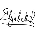
Although the capitals are large in proportion to the body, it is unpretentious in its clarity and simplicity.
And something that says a lot is the fact that the royal R is no larger than the initial E of Elizabeth. A fine demonstration of dignified modesty.
The signature of Queen Elizabeth is unaffected and natural and looks like the gesture of a warm and generous lady who is happy to share her recipe with a dear friend.
Now take a look at the following signature of Queen Elizabeth I
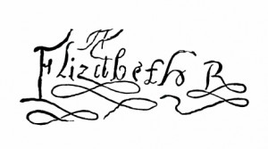
Granted that the times were different and writing styles were different too. But the essence will always remain.
While the first signature shows a clear thinking sensibility this second sample has many unnecessary embellishments. and affectations.
It looks like a woven tapestry that must have taken a lot of concentration and ages to write. It is embroidered with embellishments and affectations that are impossible to miss.
Showy, elaborate and highly decorative it is anything but modest. But then of course it ties in very well with the ruffles and elaborate etiquette of the times.
A Practical Handwriting
By way of contrast, there is a down to earth practicality in the handwriting of Queen Elizabeth 11 that is completely absent from the earlier monarch’s elaborate hand.
It is well to bear in mind that during the 2nd World War, the then Princess Elizabeth joined the war effort by training as a driver in the Women’s Auxiliary Territorial Service (WATS).
And not only that – she became a qualified truck mechanic!
As we see in this letter, the queen’s handwriting shows the strength, dignity and charm for which she was so loved and admired by the British people.
Join me at The Graphology Review to get more free articles like this straight to your inbox:







Comments